Delay Analysis Dashboard #
After running a traceback, the Delay Analysis Dashboard displays details of the activities identified on the critical path.
This interactive dashboard offers rich visualizations to highlight key factors affecting individual activities, as well as how their interplay contributes to the cumulative impact on the overall project schedule.
When used alongside the Traceback and Delay Analysis Chart, it enables you to:
- Track changes in project timing over time
- Investigate time impacts at both activity and schedule levels
- Substantiate delay claims with clear, data-driven insight
➡️ Navigation: Delay Analysis > Delay Analysis
💡 To use the Delay Analysis Dashboard, run a Traceback first.
Features provided that help you analyse delay include: #
- Change sort order between traceback/date order and delay event impact (days)
- Review the delay days
- Analysing the delay categories and activity details
Change Sort Order #
Toggle between sort options to quickly see delay impacts
- Sorting by Traceback – sorts activities in chronological order
- Sort by Delay Event – sorts the activities by delay days (increase in delay) to acceleration (decrease in delay)
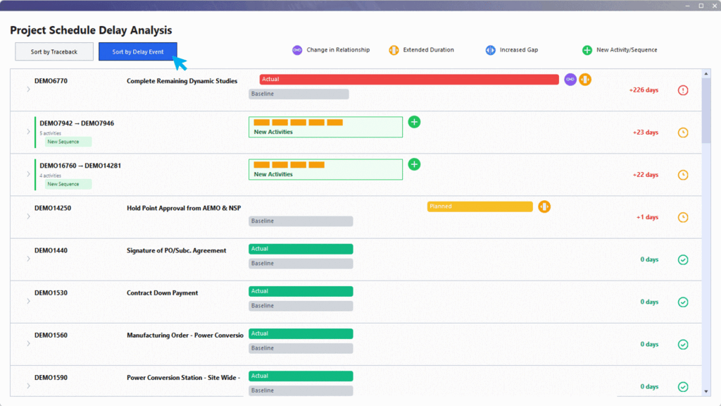
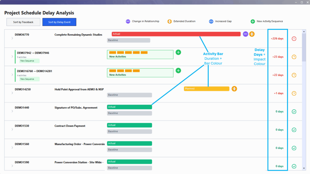
Delays Days #
The system calculates delay impacts by considering changes in duration, increased gaps, and new activity sequences. For example, if both duration and gap increase, they are summed to show the total delay.
Visualisation that supports identifying delay impacts include:
- Activity Bar / Delay Days
- Red: Major delay (30 days or more)
- Amber: Moderate delay (over 10 days)
- Green: No delay impact (0 days)
- Blue: Acceleration (negative)
- Bar Length
The length of the bar is indicative of the magnitude of the delay (though it may not be perfectly to-scale). The color and size together quickly show which events are most significant.
Delay Categories #
Delay logic identifies and categorises the factors contributing to schedule delay. Depending on the category type, additional activity information is displayed when the activity is expanded.
Delay category icons:

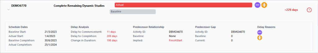
Change in Relationship #
Indicates when the relationship between activities has changed compared to the baseline (e.g., from no relationship to finish-to-start). Logic uses “implied” relationships based on the actual sequence, even if activities span multiple files. If two relationship types are equally likely, the system defaults to the baseline’s relationship to avoid false positives.
The system uses the closest fit for relationships when comparing actual schedules to the baseline, ensuring that only meaningful changes are flagged.
Extended Duration
Flags when an activity’s duration is longer than in the baseline. This is shown with a bar or color change to indicate the extension.
Increased Gap #
Flags when the gap between a predecessor and the current activity has increased (e.g., from 9 days to 18 days). This is displayed as a badge or an expanded bar, with the number of days indicated. Note: This is a warning flag; it doesn’t always mean a direct delay, but signals a potential issue.
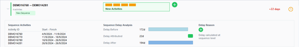
New Activity/Sequence #
Flags when new activities (not in the baseline) are added. Highlighted in green or grouped together as a sequence if multiple are added in a row. The delay impact is calculated by considering the activities before and after the new sequence in the baseline.
When multiple new activities are added together, they are grouped as a sequence for delay calculation. This allows for more accurate impact assessment.
